Do Clickbait YouTube Thumbnails Work (Without Lying)?
Let’s talk about the word “clickbait.” Most creators hate it. Viewers say they hate it. But, when it’s done right, “clickbait” simply means: you packaged the real value of your video in a way that people can’t ignore. The key is curiosity without deception.
In this guide, we’ll keep it practical. You’ll learn what actually makes a scroll-stopping thumbnail, how to use ethical “clickbait” to boost CTR, and a fast step‑by‑step workflow you can reuse on every upload.
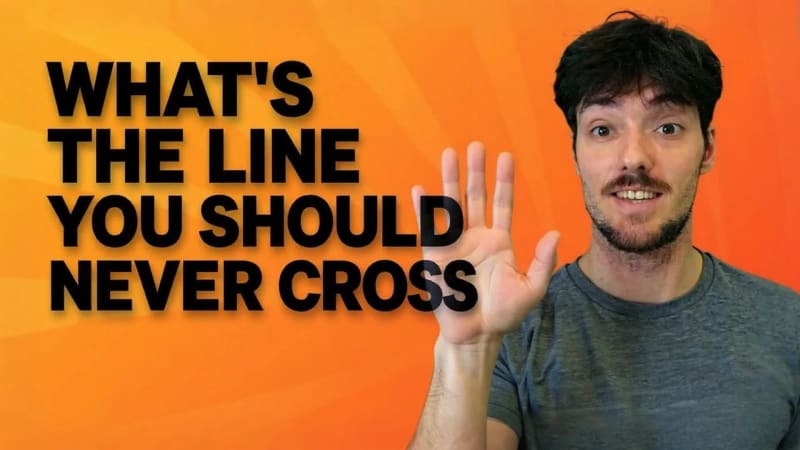
What’s the line you should never cross?
Clickbait that kills channels: exaggeration that doesn’t pay off. If the thumbnail/title promises X, your video must deliver X, ideally in the first 30-60 seconds. Misleading packaging trains viewers to stop trusting you and burns your audience over time.
Ethical clickbait is simple:
- Set a strong promise
- Build honest curiosity
- Deliver quickly in the video
Do that, and your CTR rises without tanking retention or trust.
What actually makes people click a thumbnail?
Use these levers. They work across niches.
- Face and eyes: Humans search for faces first. If you’re on camera, crop tighter than you think. Emotions read even on 120px.
- One focal point: One subject, one action. If your eye doesn’t know where to look in 0.3s, you lose the click.
- Big contrast: Light on dark (or vice‑versa). Heavy separation between subject and background beats “busy cool” every time.
- Micro‑story: A before/after, a problem/solution, or a reaction. Your image should hint at a narrative.
- Tiny text (max 3–4 words): Use text to label the story, not to retell the title.
- Visual metaphors: Thermometer for “heat,” chains for “locked,” red arrow for “found it,” tape for “fixed,” etc.
What is the C.L.I.C.K. framework?
When you’re stuck, run your idea through this:
| Principle | Ask yourself | Quick fix |
|---|---|---|
| Contrast | Readable at 120px? | Add separation, glow, or color blocking |
| Look | Where do the eyes go first? | Use face, hands, or arrows to guide |
| Intrigue | Is there a “what happens next?” tension? | Add a reveal, obstacle, or progress element |
| Clarity | Can you explain it in one short sentence? | Remove extras; simplify to one focal point |
| Kicker | Is there a small amplifier element? | Add emoji, prop, progress bar, checkmark, or timer |
What are examples (good vs bad)?

- Good: Close crop of your face, surprised expression, bright background, red circle around a tiny setting. Text: “Hidden Fix.” The story: you found a specific solution.
- Bad: Screenshot of a whole dashboard, tiny text paragraphs, five colors, no focal point. The story: none.
- Good: Hand holding two thumbnails side‑by‑side, one dull (X mark) vs one bold (✓). Text: “A/B Winner.” The story: you tested and found what worked.
- Bad: All caps text wall like “THIS WILL CHANGE EVERYTHING IN 2025” covering the subject. The story: vague hype.
How do you build a thumbnail in 10 minutes?
Here’s a repeatable workflow you can do with any editor. If you want to test variations quickly, try our tools linked below.
- Pick the moment: Find a frame with a clear emotion or action. If you aren’t on camera, pick a strong object or logo instead.
- Cut the subject: Rough subject cutout is fine. Add a 3-6px stroke or outer glow for separation.
- Block the background: Drop a bold color or simple gradient. Avoid busy photos unless they support the story.
- Add the micro‑story: Arrow, circle, or prop that points at the “aha.”
- Add tiny text: 2-4 words, heavy weight, high contrast. Place away from the face.
- Shrink test: Zoom out to ~10% or export a 120px preview. If it’s mush, simplify.
- Mobile sanity check: Make sure the bottom‑right corner isn’t critical (time‑stamp overlay).
Which colors and fonts should you use?
- Backgrounds: Deep blue, charcoal, or off‑white are safe. Neon accents for emphasis only.
- Skintones: Warm up slightly; avoid over‑saturation that looks synthetic.
- Text: Use one typeface. Bold/Black weight for the label; no outlines unless needed for contrast.
- Brand: Keep 1–2 brand colors recurring so repeat viewers recognize you.
What are ethical title + thumbnail pairings?
Use these honest “curiosity gaps.” They tease, then pay off early in the video.
- Thumbnail: You pointing at a small toggle; Text: “One Switch.” Title: “The YouTube Setting That Fixed My CTR.”
- Thumbnail: A dull vs bold thumbnail; Text: “New Winner.” Title: “I A/B Tested 5 Thumbnails: Here’s What Won.”
- Thumbnail: Hand covering half of a chart; Text: “Hidden Lift.” Title: “The Thumbnail Change That Added 2.1% CTR.”
How should you test thumbnails?
You don’t need to guess. A/B test two to four concepts and keep the winner.
- YouTube’s built-in A/B testing: compare up to 3 thumbnails at once
- Get instant AI feedback before publishing: /tools/thumbnail-tester
- Resize perfectly for YouTube and shorts: /tools/youtube-thumbnail-resizer
Small wins compound. A sustained +1-2% CTR is huge over 50+ uploads.
What’s the quick pre‑upload checklist?
- One clear focal point
- Strong separation (stroke/glow/background block)
- Text ≤ 4 words, giant and legible
- Micro‑story visible at 120px
- No deception; payoff delivered in first 30–60s
- Tested at small size + in feed preview
What’s the final takeaway?
Clickbait isn’t the enemy; broken promises are. Package your real value with contrast, clarity, and curiosity. Then test, iterate, and keep what works. Your audience and your analytics will thank you.
Grow Your YouTube Channel
Ready to create viral thumbnails? Choose your plan and get started!
Get Started